by Laurence | Mar 10, 2008 | Local search
From Canada’s Financial Post, here’s an interesting summing-up of last year’s Geosign implosion, courtesy of Ahmed Farooq of iBegin.
(Alas, I had skipped over an earlier post on this topic from Peter Krasilovsky, so this was mostly news to me.)
The short version: Geosign operated a bunch of domains that existed solely to serve ads. Some of these sites included ‘real’ content as a cynical fig leaf.
Googlers know how it goes: You search for ‘XYZ’ and click on an ad (or a result) that looks promising, only to land on a site full of more XYZ-related ads — some of which lead to yet more ad sites, the AdSense version of an infinite loop.
Since advertisers pay by the click, this provides easy money for companies that are willing to waste your time. ‘Arbitrage’ is the common — rather charitable — name for the method.
Google ultimately cut off Geosign, presumably because it was hurting the value of Google’s ads, and the company fell apart.
As a strategy, arbitrage isn’t so dissimilar from search-engine marketing (SEM), or even from search-engine optimization (SEO); it’s all a matter of degree. And when your content is advertising, as it is for Yellow Pages sites, the line gets even blurrier.
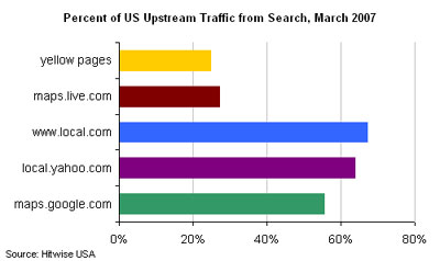
So what separates Geosign from the rest of the local universe, which also depends heavily on search-engine traffic? Witness this chart from Hitwise, recently highlighted by Mike Boland at Kelsey:
It’s arguable that Geosign is just the chart’s reductio ad absurdum. Obviously we can make distinctions, but I’d be worried if I were above, say, 35% on this chart and I weren’t Google or Yahoo.
OK, it’s definitely impressive that Local.com gets more of its traffic from search engines than does either Yahoo Local or Google Maps. Probably the same is true of Marchex, which operates domains like 20176.com.
But if Google and Yahoo want to move their own bars to the right, they can easily do so. It’ll come from the hide of Local.com, Marchex and similar companies.
And one big lesson of Geosign, scary and refreshing both, is that Google is willing to nuke a 9-digit business overnight.
by Laurence | Jul 16, 2007 | Competitors, Local search
I generally don’t read Wired magazine unless I’m flying, so I haven’t seen much of it lately. But yesterday, in Dulles airport on the way to California, I picked up the July issue & noted this cover line:
Google Maps and the Rise of the Hyperlocal Web
Turns out there were two loosely related stories inside: A sloppy kiss for Google Maps as a platform for the coming geoweb, and a “dispatch from the hyperlocal future” from cyberpunk author & pundit Bruce Sterling.
I agree that Google Maps — Google generally, really — is setting some of the terms of debate in local, and that KML, the emerging standard it acquired via its purchase of Keyhole, is a Good Thing.
Still, the story went a bit far in its “game over” portrayal of Google Maps as the epicenter of a movement that’s (according to me, anyway) far too young to have a leader, let alone a winner.
The story’s broader points were well taken, however, and the overall thesis — that people with tools, not companies with algorithms, will power this geostuff — captured something real. As always, I don’t like the facile equation of local=maps, but what can you do?
All of this dovetailed nicely with another July feature, a nice profile of Luis von Ahn — a MacArthur winner with a human-centric outlook on computing. The most interesting article in the issue, by far, and obviously applicable to local.
Bruce Sterling’s riff on hyperlocal, alas, was speculative quasifiction, and darn near unreadable. I’d like to see Wired tackle what “hyperlocal” actually means, but this was just a parade of buzzwords, mostly made up.
by Laurence | Jun 18, 2007 | Competitors, Local search, Loladex
Palore is a simple browser tool that recognizes when you’re using a local-search site and artfully annotates your results with little informational icons.
An annotated result on Google Maps looks like this (I’ve circled the Palore icons, which wouldn’t normally appear on Google Maps):
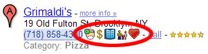 Mousing over an icon gives you a pop-up with more info. The little doctor icon, for instance, shows health-violation data. You might also see reviews, booking links, and more.
This is extremely useful: In essence, Palore is showing Google — and everyone else — how to address some of the weaknesses of a map-dominated interface. (My somewhat outdated post on Google’s UI is here.)
Palore is supposedly in closed beta, by the way, but you can download some specialized versions (kosher, Zagat, “green”) from its home page.
I read about Palore a while ago and thought it was a great idea — which is another way of saying that it’s kinda like Loladex. Apparently it has done very well in Israel, where it started.
When I finally got around to downloading it today, however, I found that the specialized versions don’t appear to include the most important feature: The ability to pick & choose which icons get displayed, and how they get displayed — to switch off everything except the health-violation icon, say, or to put the menu icon first.
Maybe this functionality is in the non-specialized version? Certainly it’s implied by Palore’s home-page text:
- “Use Palore to see the things you care about when looking for restaurants and other local businesses online”
- “Choose from dozens of information-icons that will instantly appear in any search site you use”
Yup: That’s what I want! So why can’t I do it?
Assuming the “real” beta works the way I’d like, or at least that it ultimately will, here are my nominations for what else could be better about Palore — which I really do admire, by the way:
- I’m sure Palore hears this from everyone: No one wants to download a browser add-on. It’s pretty painless, but it’s still a psychological hassle & it limits their potential audience. Airfare metasearcher Sidestep went this route for years until, in essence, it was forced to change its focus by fast-growing competitors such as Kayak. Sidestep still offers a plug-in, as well as a Google toolbar with integrated Sidestep functionality, but both options are buried in its destination Web site — as they should be. Palore is building its model on a behavior that its users will adopt only grudgingly.
- Very much related: Palore adds information to other sites’ search results, but it doesn’t allow me to adjust the results themselves. If Palore knows that I care about vegetarian restaurants, for instance, it knows that Google Maps’ #9 result is much more relevant than the #1 result. But as the user, I’ll still need to scroll down to realize this fact. Worse, the most relevant result may be on the third (or thirtieth) page of results.
- Both of the above complaints amount to the same thing, I guess: Palore would be better off building a destination site. The local-search space is still wide-open, and they should have the courage of their convictions. Maybe they figure they’ll get more traffic by piggybacking on established sites, but I bet they’re wrong.
- Palore doesn’t seem to be exposing an API that would allow anyone to power an icon without their mediation; instead, you’re asked to contact them about “partnering opportunities.” No matter how streamlined their process is, it’s more limiting than do-it-yourself. Not very 2.0.
- Palore seems overly focused on restaurants. (They address this in their blog.)
- A minor quibble: Palore doesn’t work on Yahoo Maps, because Yahoo Maps is built in Flash. That’s a big traffic source, and could really benefit from Palore icons. But of course I’ve already recommended that they move away from this model, so I can’t complain much. And I don’t think it’s addressable, anyway.
Having said all this, I must add that I hope Palore doesn’t read this post — or, if it does, that it doesn’t take my advice. If it did, I’d have a scary competitor.
by Laurence | Apr 16, 2007 | Competitors, Local search
Now don’t get me wrong: Maps are an important element of local search. What’s more, Google Maps was a force for good when it launched, and possibly still is.
But when it merged its mapping and local products, Google cemented a meme that’s been pushing local search into too narrow a channel, both for Google itself and for the competitors it influences.
The meme, in short: Local = map.
Or worse, local = big honking map.
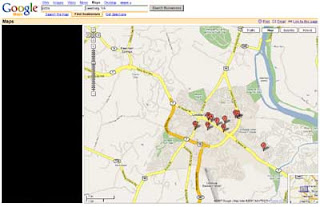
Here’s a (shrunken) screengrab from Google Maps for my classic sample query, [ Pizza ] near [ Leesburg, VA ]:
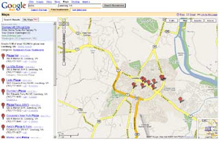
Presumably Google thinks the map is the most important thing on this page. On my screen it takes up ~75% of the space, and it expands along with my browser window.
By contrast, the results column on the left — the actual most important thing on the page — is constrained to 300 pixels. Even if I make my window bigger, it won’t get any larger.
Now compare the information that’s available from each of these two elements — the immediate payoff. The results column is information-rich, and is meaningful as a standalone element. That’s a high payoff. But the map is meaningless without either (a) looking at the left column; or (b) clicking on one of the stick pins.
Furthermore, the map can’t simultaneously display all of the information that’s being shown in the results column. I’d need to click the map ten times to expose it all — if the stick pins were all clickable, that is, and not stacked on top of each other.
And of course, a map might not even be relevant to my results. When I search for “pizza,” I may be interested in the exact location of each matching business. But when I search for “plumber,” or even “pizza delivery,” I’m probably not — what matters is service area, which is only roughly related.
In other words, Google’s map may seem like a strong visual summary, because that’s how we usually think of maps, but it’s actually very ineffective. It looks nice, to be sure, but it’s a terrible waste of space.
Black it out, and what have you lost?
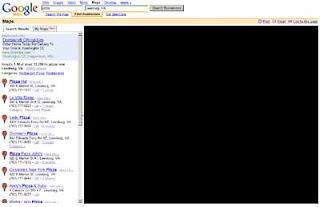 Very little, I’d argue. The same can’t be said about the results column:
 This doesn’t mean there shouldn’t be a map on the page, of course. I don’t even object to the size of the map, per se. The problem is that Google has left only 300 pixels in which to do everything else — which, as a practical matter, means it can’t do much.
Take Google’s new “My Maps” functionality, which launched the other day. It’s kinda interesting and philosophically in sync with Loladex. But of necessity it’s hidden behind a tab in the left column, where I can’t imagine it’ll have a chance to flourish.
That’s a real shame (except maybe for Loladex).
Indeed, Google can’t fit much except names and addresses in 300 pixels, which seriously limits the evolution of its product.
It can innovate within the map, I suppose, but IMO a map simply isn’t a good vehicle for displaying a result set in which the content of individual results is neither uniform nor already known by the user.
Supplementing or illustrating such a result set, yes — but not displaying it.
Not all of Google’s competitors are quite so constrained by their own maps, but it’s just a matter of degree. Google has framed the debate, as it so often does, and now any product without a huge map on the results page seems somehow … suspect.
Needless to say, Loladex won’t have a results page that’s overwhelmed by a map. Maps will enrich our site, but they won’t determine its shape.